Curated an experience that makes it easier for users to search a robust, resource-filled site.
Client
Cleveland Public Library
Year of Project
2024
Role
Senior Visual Designer at Fueled + 10up
―
Cleveland Public Library (CPL) serves its community through more than 20+ branch locations and serves as both a research and “pop” library with an extensive library collection. They also host numerous community events and provide a range of services in the community through their branches and outreach initiatives in and around Cleveland, Ohio.
The main goals of the project were restructure their content and make the site more visually appealing so users felt inclined to engage and discover all that CPL has to offer.
Design Vision
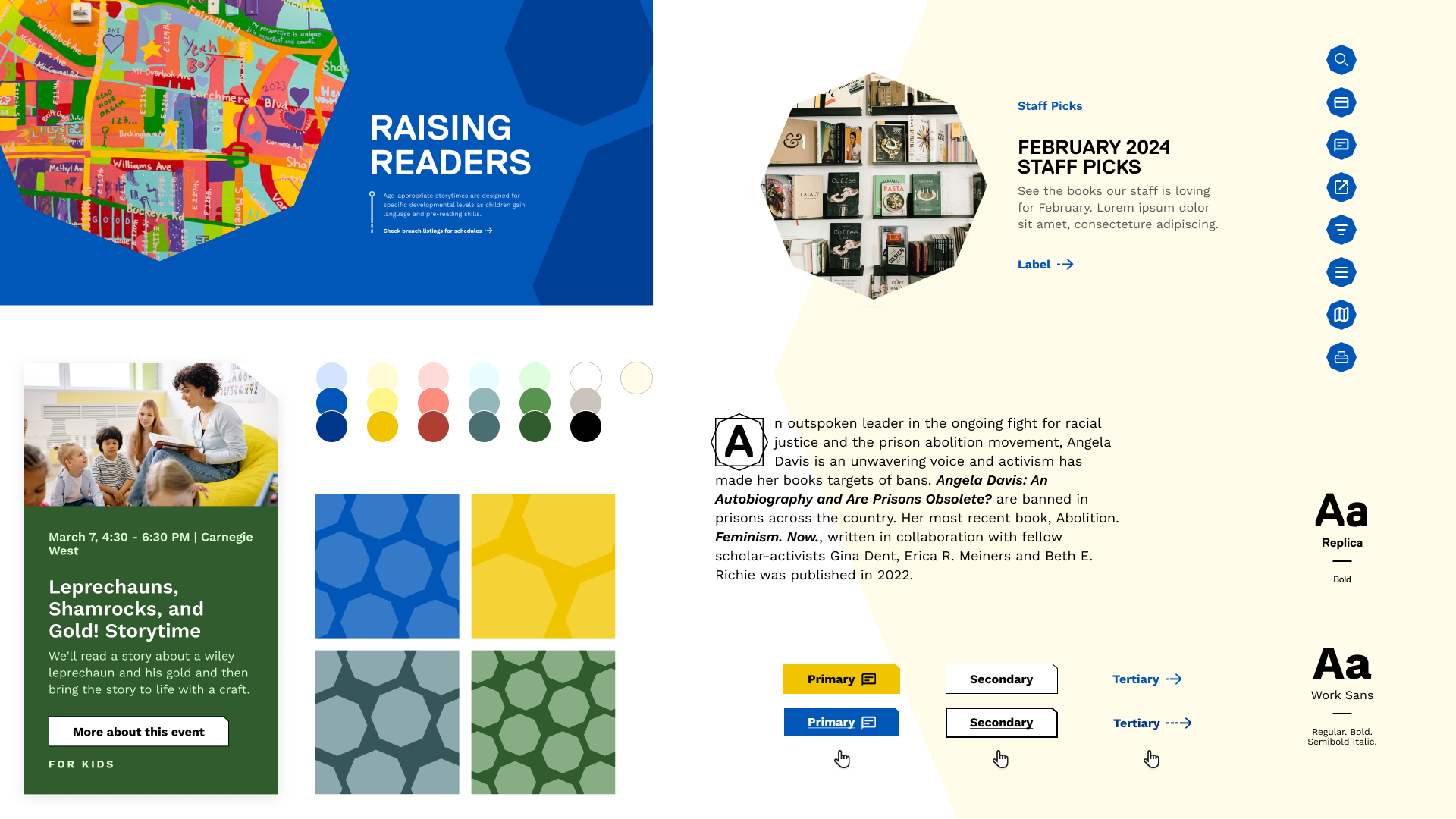
My aim was to revitalize the CPL website with vibrant colors, brand recognition through shape use and custom icons, striking yet subtle animations, and thoughtful usability choices to ensure the Library’s character and care came through.
Visual Direction
With accessibility being a key goal in this redesign, the introduction of new tones to their existing palette helped bring them into compliance along with the implementation of best practices for hover states, character count, and screen readers.
Tying into their logo, I introduced the octagon as a brand anchoring element woven throughout the designs as patterns, image masks, and even the smaller details of the notch on buttons.
Navigation
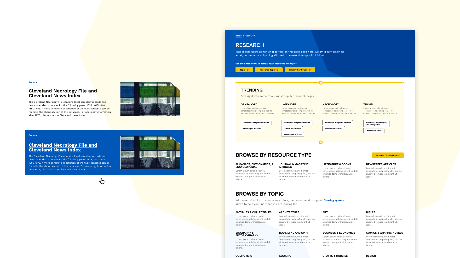
Our UX team worked hard to restructure the CPL information architecture to ensure that when people came to the site it was intuitive where they could find the resources they were looking for. Working closely with them, I designed a navigation experience that visually prioritized the most searched for items.
Information Density & Accessibility
Since the CPL site is rich with information, it was important to balance key information through the use of color blocks and type hierarchy.
Accessibility was also at the forefront of these designs. I ensured that all elements met not only WCAG 2.2 requirements but also had multiple indicators if they could be interacted with.
Interactivity
When it came to animations, I made sure that there were multiple visual cues to showcase when something could be interacted with as accessibility was a major player in this project. Throughout the process, I collaborated with the front-end development team to create smooth and subtle animations.
Yellow was used a primary actions, and blue was more exploratory and secondary actions.
Tying in the bold blue as a highlight for the entire clickable space rather than just the text area gives the user more flexibility with where they can click. I also added a thin white border around images on hover to ensure colors from the imagery would still be visible against the blue.
Key Solves
Reinvigoration of Brand Use
By giving the brand more definition and leaning into color and patterning, it shows the brand as more confident and vibrant, which aligns with how they are in the community.
Accessibility-Forward Thinking
Since CPL is an inclusive company, this was an extra important task to make sure we not only met but exceeded the standards for what an accessible site looks and acts like.
Content Discoverability
Along with the full content restructure, more opportunities to surface content in new areas has given the CPL team the ability to showcase the breadth of the good they are doing for their community.


